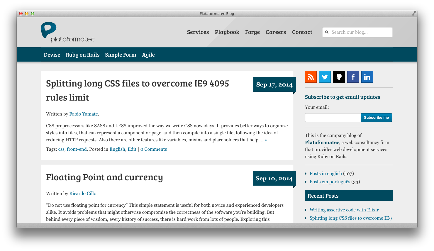
Today we are shipping a whole new design to improve your navigation and reading experience on our blog!

Back in 2012 we rolled out our new visual identity and website, but we didn’t change our blog much at the time. So we decided that it was time to give some love to our blog and work on a full redesign over the last couple of months. We are really excited to release this work for everybody who reads our posts.
Fonts are bigger, colors are brighter and everything looks much better on your smartphone than it used to. We focused on improving the reading experience and on a more up to date look for our blog.
The whole development process was a great experience, from design to code, and I want to share some of the story of how we got there:
The (re)design process
At first we started sketching everything with HTML and CSS trying to put together our new look with some elements of our existing layout. As things started coming into shape, the next step was to put together a Jekyll website with all of our blog posts (thanks to jekyll-import) so we could easily test the new design against our existing content, rather than against a bunch of “Lorem ipsum” posts. This was really useful when reviewing the code snippets in our posts and visualizing how we could improve the syntax highlight using something else than the previous WordPress plugin we were using.
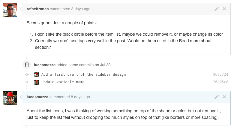
As we designed and prototyped each piece of our new layout, people outside the redesign project jumped in and participated through the Pull Requests that we used for building those blocks. A good part of our team was part of the whole process helping out with design/code/copy feedback.

The Journey into WordPress
One of the first decisions was to keep using WordPress as our blog engine. Over the last years a lot of alternatives have surfaced (like Ghost), but WordPress still feels the most complete blogging solution for us, so we’re still using it for the time being.
Given that, one of our challenges was to learn how to work with WordPress and convert our design (built on top of a Jekyll site) into a WordPress theme that we could install in our blog. This task ended up being much easier than expected.
After finishing the first complete iteration of the layout, I spent a few days watching some of the WordPress courses on Treehouse to learn how to work with WordPress themes and the whole PHP API behind it. I’ve mixed together some Bash scripts, a proxy server built with rack-legacy and some Gulp tasks to automate a local WordPress environment and migrated our Jekyll templates into PHP ones and we were set!
This might sound a bit too complicated, but the idea of starting with Jekyll to focus on the design process and quick iterations to later worry about the theme “infrastructure” was a well payed bet so I didn’t have to juggle both problems at the same time.
The best is yet to come
The idea is to not stop here. There are still a lot of improvements we want to do on our blog and all the tooling we have put together makes it easy to jump back and iterate over the design and the code.
Let us know if you find anything broken around here and we will jump on it to fix it. We hope you enjoy this new look and feel while reading through our blog posts :heart:!

Congratulations to yall!
So much better! Congratz.
Great job, man. Looking good!