
Since I started working on software development, I have been dealing with two important, but not always convergent aspects: product scope and delivery flow. The process of aligning the expectations of product increment and team throughput is usually arduous, but when this happens, it improves the chances of project success.
I will present here how Plataformatec is using Throughput and Burnup charts during a project life cycle. This content belongs to a series of blog posts on how metrics can be useful to improve the software development process. Read more in Power of the metrics: Don’t use average to forecast deadlines and Why we love metrics? Learning with Lead time.
Learning from Throughput
LeanKit defines Throughput as the average number of units processed per time unit. In a Kanban system, examples can include “cards per day,” “cards per week,” or “cards per month.”
An important observation to make about Throughput is that this metric is different from “Velocity” in Scrum. Velocity measures the amount of Story Points delivered per iteration or Sprint.
At Plataformatec, we consider Throughput as the number of issues (e.g. user story) done per week.
Usually, we analyze Throughput to answer questions like:
- How many user stories the team delivers per week?
- Is the team creating an increasing delivery trend?
- Is something blocking the team?
Let’s see a practical example. Imagine a situation that you, as a Development Manager, need to help the team to explore the past Throughput in a campaign to generate future enhancements.
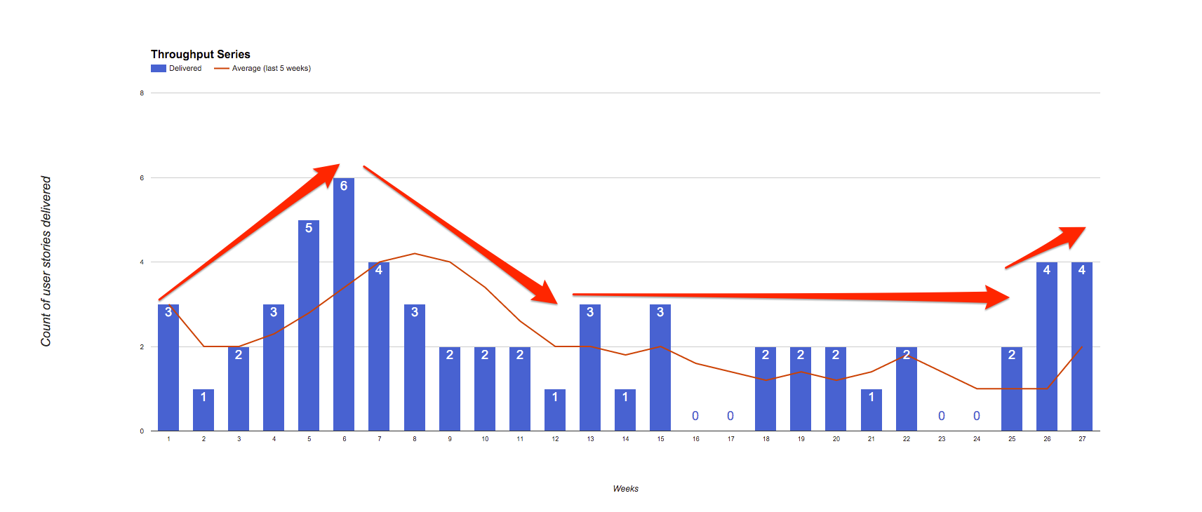
First, we can observe in the chart above that only in 15% of the weeks (4 of 27) the count of stories delivered was zero (0).
It’s possible to extract further information from the chart regarding the trend. If Throughput is growing, the team is increasing the number of user stories delivered in a week, however if the trend is decreasing, this may put the project schedule at risk. A lower limit can be implemented to provide an indicator of when corrective actions might be needed. In this team, Throughput ramps up in the first weeks, followed by a slight decrease and lastly stabilizes.
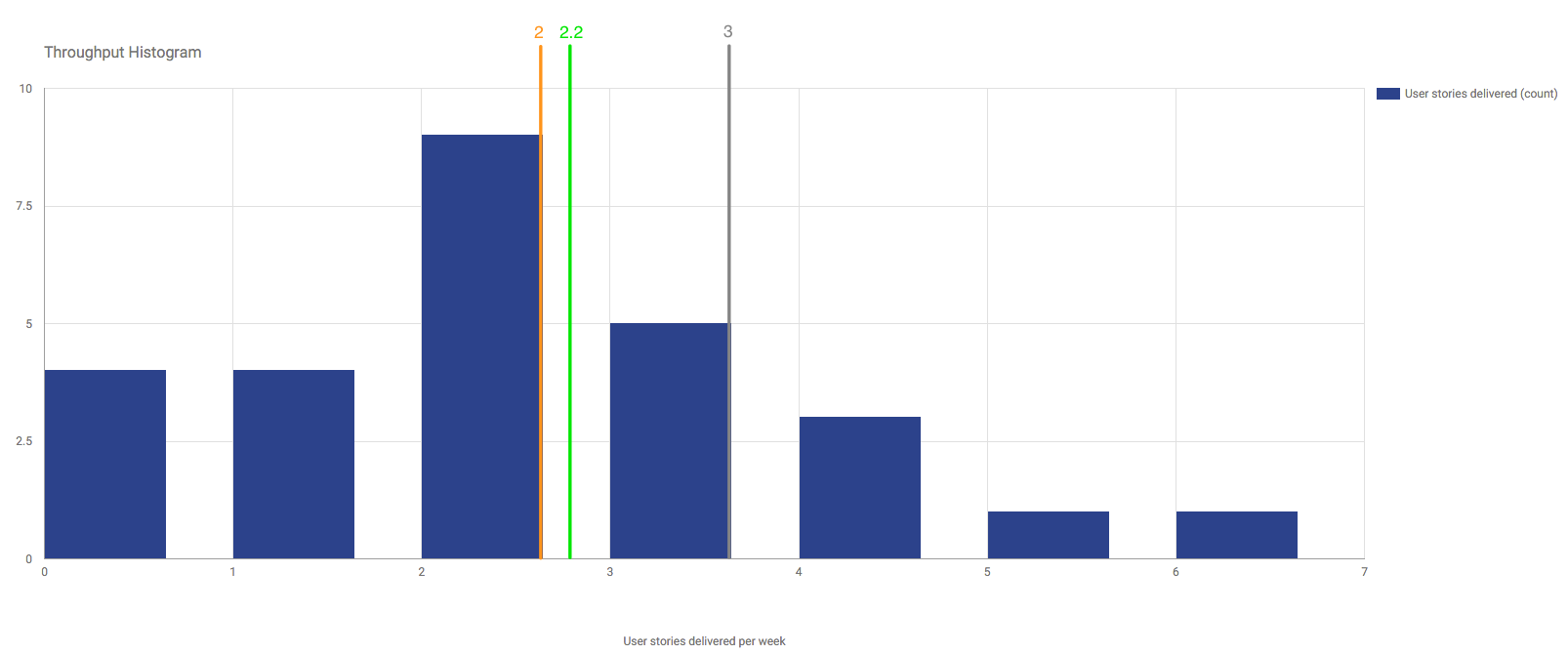
Looking at the Throughput distribution, illustrated in the histogram above, we have a situation where the average (green line), the mode (orange line), and the median (orange line) are almost the same value (approximately two). Therefore, it is reasonable to say that this team alone can’t produce more than two user stories a week consistently.
Another way to validate the argument about the team’s capacity is to look for the 80th percentile (gray line). It tells us that only in 20% of the weeks, the team delivers more than three user stories a week.
A good practice that we have set for our projects at Plataformatec is a weekly Throughput check, as a process of understanding causes that impact the team’s achievements. Usually the reasons for a decrease in Throughput have been:
- Bad requirements (e.g. user stories with a poor definition of done criteria);
- Technical debts (e.g. unexpected necessary refactorings);
- Process bottlenecks (e.g., QA overloaded, troublesome deployment pipeline);
- Backlog with a low level of items ready for development;
- Scope change (e.g. changing the scope of a user story in the middle of a Sprint).
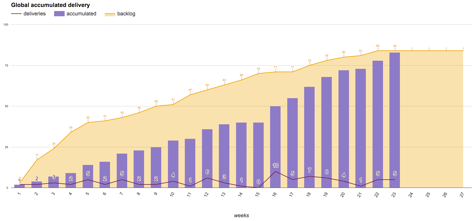
Looking at the Burnup Chart
The Burnup chart is a valuable tool for backlog management because it tracks how much work is done by a team, and it gives more information than a burndown as it combines scope and delivery in the same visualization.
It’s common to see burnup charts with a trend line to estimate the project deadline.
I see Product Owners and Agile Coaches developing forecasting scenarios based on three perspectives:
- Worst case: assume how the team will perform in the future based on the lowest value of their historic Throughput.
- Best case: consider that the team will perform in the future based on the highest value of their historic Throughput.
- Average case: consider that the team will perform in the future based on Throughput average (I recommend reading the blog post that I wrote regarding why you shouldn’t use average as a measure).
In our context, burnup charts are helping us to answer questions like:
- Is the project backlog growing in a healthy way?
- When will the team finish the current project scope?
The example that I will show below happened with a Plataformatec customer. The circumstances were:
- Project duration: 23 weeks (almost six months).
- Client expectation: create a solution to solve an internal process problem (green field project).
- Product roadmap: after the initial session of story mapping, the team and the customer reduced the product scope
- Project challenge: ensure that the software will be available to use at the end of the project.
In this project, we used the Burnup chart to communicate the project progress. The graphic was developed to display:
- the current size of the backlog;
- the number of user stories delivered;
- provide a forecast of when the software would be delivered, as we developed a model based on linear regression to forecast delivery scenarios (most likely, worst and best) based on a 95% confidence interval (more on this on upcoming posts).
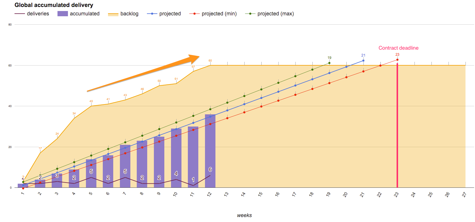
The next three graphics represent the project in the beginning (first six weeks), in the middle (twelve weeks) and at the end (23 weeks).
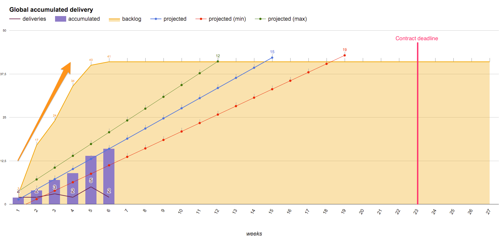
Analyzing the beginning of the project, we had a scenario of increasing backlog and some deliveries.
Regarding backlog, this increase was due to the refinement of user stories generated in story mapping. An indicator that could be useful to analyze the backlog growth is to calculate the weekly increase rate of new user stories (in this case we had seven user stories created per week). For us, such indicator has been essential to maintain a predictable growth of our projects backlog.
In the middle of the project, we had a situation of continuous backlog increase in a rhythm of six new user stories per week. This time, we had to sit down with the customer to align ways to simplify the backlog, because if the backlog had continued to grow at such rates, we would hardly deliver a software version at the end of the contract. The Burnup chart was also useful at this time to help the team define strategies to improve Throughput based on the results of accumulated deliveries made up to that point.
The forecasting technique used was important for us to get to the end of the project delivering all the necessary features for the software.
As we carried out a lessons learned session at project conclusion, we considered the Burnup Chart useful because:
- We brought visibility to the software development process ensuring that the customer was aligned on the progress of deliveries.
- We showed visually how the backlog growth could influence the outcome delivered at the end of the contract.
- We used forecasting as an expectations alignment tool for the project deadline.
Summary
In my opinion, the practice of tracking Throughput means that the team is looking for process improvements based on numbers which could make this more transparent for all stakeholders involved in software development.
The Burnup chart is a powerful communication tool to use with project stakeholders because it shows how scope changes affect a project deadline, and at the same time it informs current progress.
What about you? How are you using Throughput and Burnup Chart in your projects? Share your thoughts with us in the comments section!
Ps: In the next blog post I will talk about a visualization tool that is helping us to recognize process bottlenecks.
