One of the big questions that an Agile Coach may face during his career is: How can I help the team to continuously improve the software development process? In this blog posts series, I have been sharing some of Plataformatec best practices that are helping us deliver better projects through a set of metrics and charts. For more information, I invite you to read:
- Throughput and Burnup charts
- Learning with Lead time
- Looking at Lead Time in a different way
- Don’t use average to forecast deadlines
Today, I will present two techniques that could be valuable if you are trying to get a grasp on the big picture of the team process.
CFD
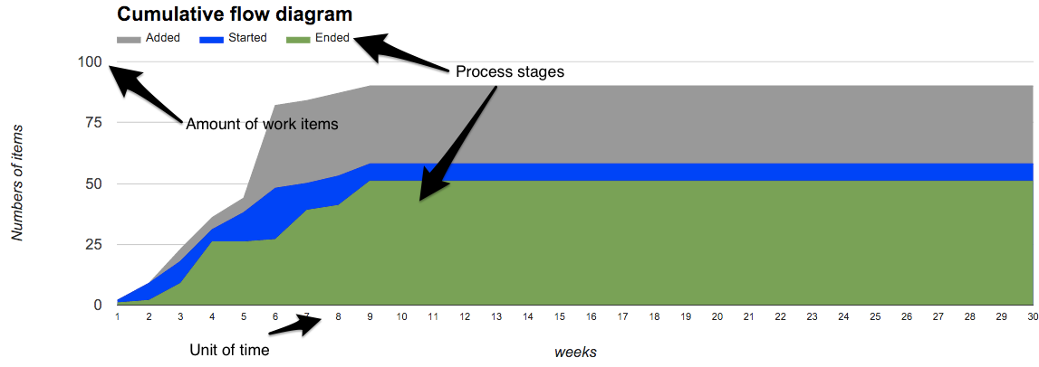
Quoting Brodzinski, the Cumulative Flow Diagram (CDF) is one of the charts that gives us a quick overview of what’s happening in a project or product activities.
CFD is a valuable instrument for tracking and forecasting agile projects. Using it you can quickly check the current status: how much work has been done, what is in progress and how much is still waiting to be done in the backlog.
In a CFD representation, the horizontal axis represents a period, and the vertical indicates the cumulative count of items in the process (e.g. amount of user stories). Each painted area on the chart relates to a workflow step (e.g. to do, in progress, done). For a better understanding, check out the picture below.
To demonstrate how we are using CFD I will show next an example that happened with a Plataformatec client. In this case, we had a Kanban composed by the following steps:
- Backlog: User stories that need to be refined.
- Ready to Dev: User stories with acceptance criteria defined and with an explicit definition of done.
- In Developing: User stories in development.
- Testing: User stories in QA validation.
- Accepted: User stories released in production.
In this project, we used CFD to communicate the project progress, to identify process bottlenecks and to manage process queues. We chose to label time through a week perspective because we needed to report weekly the project status to the client’s CTO. To build the CFD, we tracked the date that a particular user story starts in each step of the workflow.
The next three diagrams represent the project at the beginning (first seven weeks), in the middle (eleventh week) and at the end (week twenty-two).
The beginning
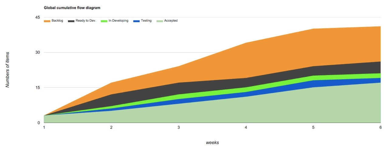
At the beginning of the project, the team dealt with a situation that more user stories arrived to the backlog than departed to production (the team average throughput was three user stories per week and the backlog increased at a rate of seven user stories per week). This type of pattern is not so good because it means that WIP should grow over time. At that moment, the team and the PO discussed solutions for the backlog growth rate according to the team throughout. Just to be clear, it’s common for the backlog curve to grow sharply at the beginning of software projects.
Another piece of information that can be extracted from the graph is some items created but not detailed in the backlog. In this regard, the Agile Coach did an excellent job helping the project PO in the preparation of user stories for the team. At this moment, the team had a stack of user stories prepared for development.
The middle
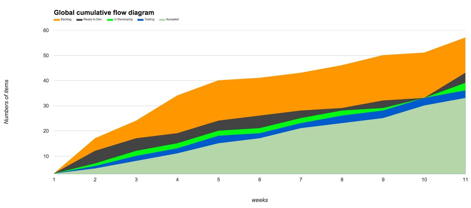
Looking at the CFD in the middle of the project is possible to see that the development team and the QA didn’t have bulging bands, which is clearly a signal that the process of coding and validation were not overloaded. Comparing to the last follow-up (first six weeks), at this moment, the rate of user stories created and user stories delivered was almost the same (in this case, three user stories per week), but the team knew that the throughput needed to increase. The project was still dealing with backlog problem definition (fifteen user stories were not prepared for development). One of the factors that caused this issue was the high uncertainty caused by visual aspects that accompanied the features that would be created.
The end
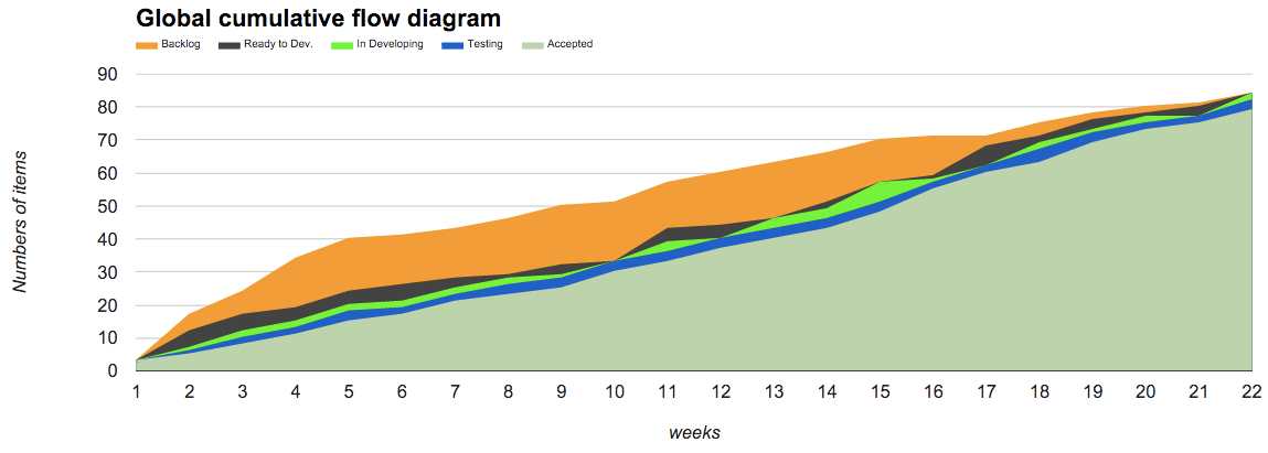
An interesting thing that we realized at the end of the project was that work in our Test column flows through all the project very quickly. Looking at the chart, it’s possible to recognize that the blue bands (Testing step) disappear quickly. In this case, this situation happened because the interaction between the development team and QA was intense. Regarding backlog, in a particular moment of the project (more precisely in week nineteen) the team and the PO aligned that no other user story should be created because the end of the contract was arriving and they couldn’t commit to creating new features. The six user stories generated until the end of the project were related to technical debts.
Further information that we can see from this CFD is that the team didn’t conclude all the stories in the backlog (the Accepted band didn’t cover all the diagram). In this case, the client’s development team took over the two user stories that were in development status and three more that were in the validation process. It’s important to share that all the other seventy-nine user stories of this project were released in production which leads the team to a high-quality solution and a client satisfied with the released product.
A good practice that we are carrying on our projects at Plataformatec is to check the CFD weekly, as a process that provides insight to Burnup, Throughput, WIP, bottlenecks and to drive continuous improvement (that diagram is an excellent companion to discussions about limiting/managing work in progress).
Lead time breakdown
Studying a way to improve ceremonies like project follow up or retrospective we created a visualization that we call “Lead time breakdown.”
In short, this chart enables the team to evaluate, compare and deeply review the latency between the initiation and execution of each process step of each team item (e.g. user stories).
We have been using this visualization to evaluate the process with more details than when using a CFD diagram. Usually, we use Lead time breakdown to answer questions like:
- What is going on with the WIP items?
- Is there any impediment blocking the team flow?
- Is the team handling any process bottlenecks (e.g. QA overloaded)?
The mechanism to create this visualization is simple. On the vertical axis, we have worked days. On the horizontal one, we have in progress and delivered items (e.g. the amount of user stories tracked by Kanban board). To represent each step in the process, we use a stacked bar chart.
Let’s see an example. The data that will be presented next is from a real project. The team had a workflow represented on the board below.
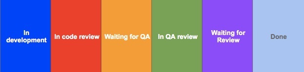
In this Kanban board, checkpoint steps were tracked to indicate bottleneck situations created from QA (Waiting for QA) or PO (Waiting for Review) during user story development. The Lead time breakdown chart of this team looked like this.
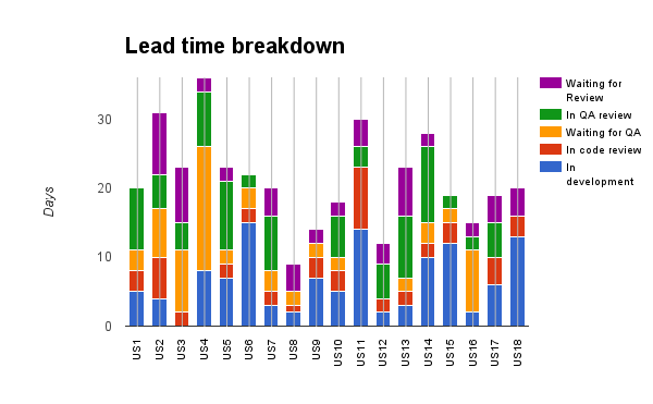
It’s possible to identify that in almost all user stories of this project the PO needed more than three days to review the features delivered. In this situation, that duration was reasonable, but in some situations, this behavior could block the release of significant product features.
Another interesting thing to look at the example is the high variability from the team coding lead time. In this case, the team worked with unstandardized user stories.
During this project the team suffered with a part time QA (see the height of the parts displayed in yellow on the chart). As the team and stakeholders periodically access the graph, such problem was evident to all and solutions were discussed to solve it. One example of a solution created was that at some periods of the project life cycle the Scrum Master was delegated to execute QA work.
As a good practice, in all projects, we have been checking the Lead time breakdown periodically as an exercise of understanding the team’s current status. This tool has been significant for:
- Guiding team discussion about how to remove waste during the development process periodically.
- Proposing process improvement based on team data.
- Visualizing waiting time during development.
- Detailing user stories assessments to increase the number of delivered functionalities.
- Assisting retrospective sessions when it’s necessary to look at the process (what does the team need to maintain? what does the team need to change?).
Summary
Visualizing the flow with a CFD or Lead time breakdown gives quantitative and qualitative insight into a potential problem in the software development process. After all, those graphic visualizations will only suggest you a problem. Tracking it in details and finding solutions is a different story.
To learn more about CFD I recommend three great references:
- The excellent article, Cumulative Flow Diagram from Pawel Brodzinski.
- Daniel Vacanti’s book, Actionable Agile Metrics for Predictability.
- The Cumulative Flow Diagram in a nutshell.
How are you using CFD? What is your opinion about Lead time breakdown visualization? Share your thoughts with us in the comments below!