
Regardless of whether you are an experienced or recent agilist, there are challenges that are part of the daily routine of any team that is seeking to create a quality software with a predictable deadline for delivering a demand (e.g., new functionality, fixing a bug, technical improvement, etc.).
Developing a vision that enables seeing and understanding the whole by analyzing the parts that form it is a great challenge when dealing with uncertain environments.
One of the ways to understand and analyze the work system of an agile team is through process metrics (there is a collection of cool content on the subject here on Ptec’s blog).
Understanding the flow from data is a pragmatic way to incorporate transparently a continuous improvement philosophy without abrupt and chaotic changes for everyone involved in the context (team, stakeholders, product area, managers, etc.). To paraphrase the Kanban community, measuring is a tool that will help the evolution and not revolution of an existing process.
Personally, I like to quantify the process when I am mapping the reality of a team, as I expose facts (data) for discussion and analysis. In my experience with software development teams, I have realized that having this type of behavior helps to reduce a subjective load that may exist on the team and is a way of confronting beliefs like “we don’t need to improve”, “we don’t have problems in the process” and “we work collaboratively”.
In today’s blog post, I’ll share a collection of metrics that will help you diagnose the health of an agile team process.
Assumptions
First of all, I need to list some reservations about using metrics.
Metrics should be used to evolve the process, not to generate destructive demands and comparisons.
Don’t be tempted to compare teams and measure an individual’s performance. If you or the company where you work are interested in rewarding individual results, engineer a method that proposes evaluating the person’s performance from the opinion of managers, peers and customers who have interacted with the results of the individual’s work. In the event of individually rewarding teams for their results, avoid metrics that are not directly related to business results (e.g. what is the value of the team delivering a number of features in the semester if product revenue has not increased?).
I share this assumption so that you and your team don’t behave according to how they are being measured. After all, as Goldratt would say: “Tell me how you measure me, and I will tell you how I will behave“.
Numbers without context are dangerous.
Any analysis done without understanding the variables that form a scenario becomes superficial, skewed and poor. If someone tells you that the number of features delivered in one team is 10 items per week, is it possible to reach any conclusion? Is this metric good or bad? What is the meaning of delivered for that team? Is it software in production or delivery in a QA environment? Well, from the previous questions it is possible to conclude that a loose number is nothing more than a symbol deprived of any meaning.
Look for trends and run away from accuracy. Given the complexity of creating a software product, do not seek to be deterministic in a world that is receptive by nature to a probabilistic reality.
The logic behind the last assumption is: we live in an environment where there is risk, that is, there is a probability of failure due to some uncertain event whose occurrence does not depend exclusively on the team’s will. Therefore, it is unlikely that the team knows for certain the delivery deadline for a demand or project. Rather than fooling ourselves with deadlines that ratify that deliveries will always happen on the same date and in the same way, let’s analyze the team’s data history to project the chance of delivering something.
These assumptions that I shared will help you use metrics effectively. Lucas Colucci wrote a very important article that presents some common mistakes when using process metrics.
Process diagnostics
Given the assumptions shared above, let’s go to what really matters. The metrics listed below will assist you in mapping the health of a team process. As an agilist, I consider that the views below form a workflow cockpit and should be available for teams to use as material for promoting process improvements (e.g., use of metrics in retrospectives, process analysis in daily meetings, etc.).
Work in progress
Monitoring the work in progress will help the team become aware of the work volume that the process has supported over time. I like this kind of view as it shows, for example, if teams are respecting a policy regarding limits to work in progress.
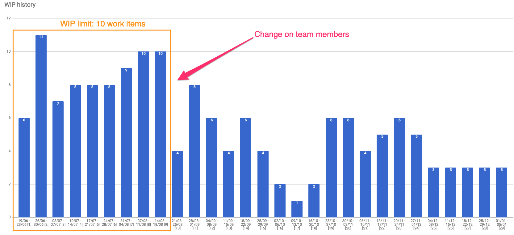
In the example above, we have a situation where the team had close to 10 items in progress a week, until at some point there was a reconfiguration in the number of people, which caused the amount of work in progress to decrease. An insight here is that this view presents an interesting history of the team, helping to identify moments when changes occurred in team structure, changes of direction (the famous pivots), obstacles, etc.
In order to stabilize the process from the productive capacity, it is important that there isn’t a growth trend for the number of items in WIP. If this is happening, the team is likely to need optimizations to reduce WIP. As an agilist, monitoring WIP will support you to reverberate the following mantra with the team: “Let’s stop starting and let’s start finishing”.
Another WIP analysis I have started is related to the lifespan of items that are in WIP within a given week. Essentially, the view considers the items that are in progress that week and accounts for how long they have been in the workflow. For an easier reading of the chart, I group the data by category where I consider the following ranges: (1) 1 day in WIP; (2) up to one week in WIP; (3) from 1 to 2 weeks in WIP; (4) from 2 to 3 weeks in WIP; (5) from 3 to 4 weeks in WIP; (6) over 4 weeks on WIP.
Still on how the view is structured, for the weeks that have passed, items that are in WIP at the end of the period are accounted for and classified. For the current week, items currently in WIP are analyzed.
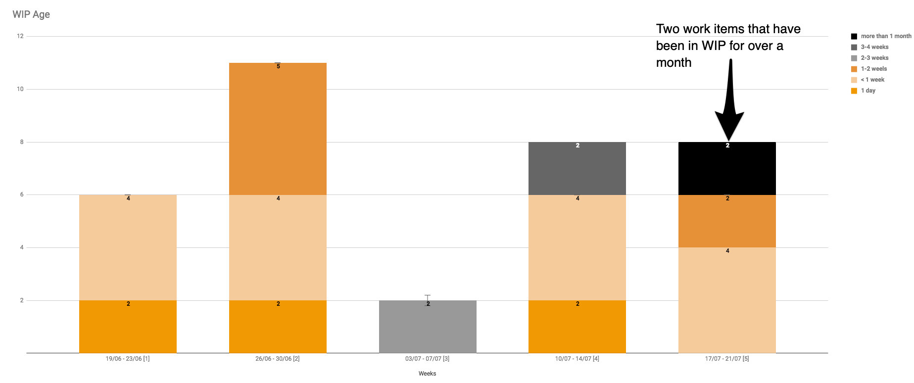
Applying it to one example, you can see that in the fifth week of WIP lifespan tracking of the team above, there were two items that were over a month in the flow. If the team, by systematically tracking their workflow, realizes that the older categories are growing, it is very likely that a bottleneck is being produced at some stage in the process and an intervention will be needed.
Keep in mind that WIP represents effort and energy that has not yet been validated and the longer the team spends carrying it, the less feedback will be received, the slower the process of validating the assumptions behind the initiatives that originate the work, and the greater the risk of the company missing on a market opportunity.
Lead time
Lead time is an important metric for teams to develop the ability to understand how long they have taken to complete a work item. In addition, teams that develop the skill to analyze such metrics can identify situations that have generated variability in the process (e.g. environment issues, exit of team members, lack of clear acceptance criteria for demands).
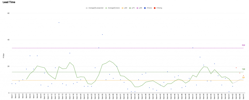
The first view that should be available for the team is the lead time scatter plot chart. It will provide an idea if the time for delivering the items is decreasing or not over time.
As shown in the chart above, I like to combine the following information in this view: completed items (represented in the chart by the blue dots) and item in progress (represented in the chart by the red dots); the moving average that considers the last 5 delivered items (this is a completely arbitrary parameter); and the information for 50th percentile (median), 75th percentile and 95th percentile.
Such reference measures are useful because, from the example, they bring to light findings such as:
- The moving average has varied over time.
- Based on the history of completed items, 50% of them were completed within 10 days, 75% took up to 16 days to complete and 95% were completed within 34 days.
In addition, the scatter plot chart can generate answers to questions such as:
- What is the team doing to handle items in progress that are becoming extreme lead time cases?
- What can be improved in the process to reduce lead time?
Another beneficial view to understand lead time is the histogram chart, because, when considering each lead time as a category, it presents data more concisely and allows extracting information about distribution behavior.
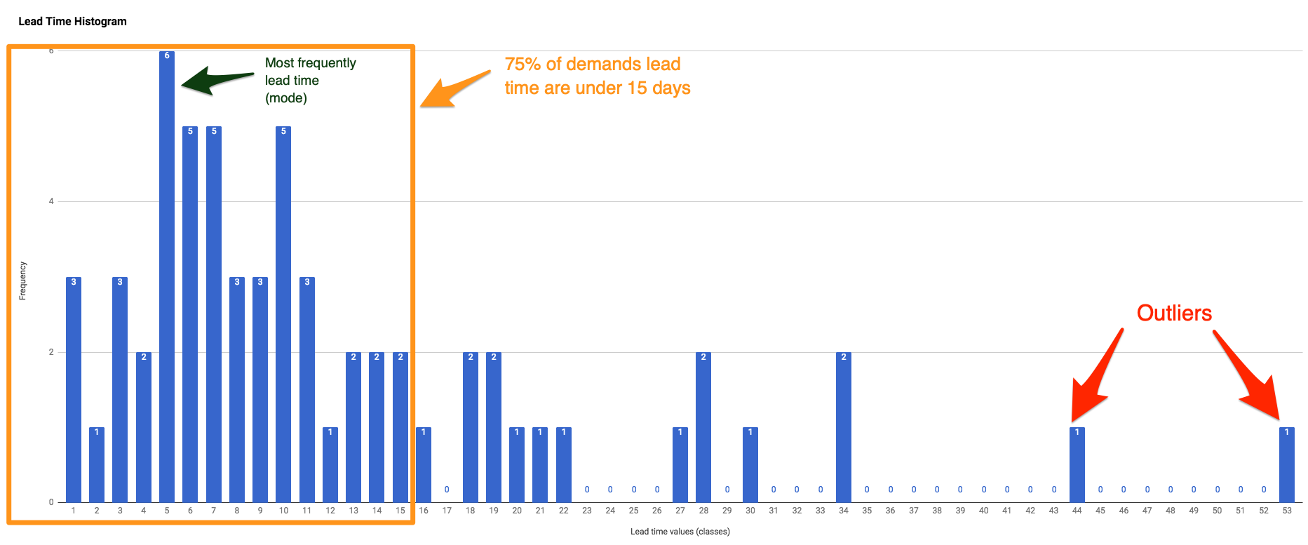
As shown in the example above, the histogram enables the team to respond to queries such as:
- What has been the most frequent lead time?
- Are extreme lead time cases very common?
- What is the distribution format? Is there a lead time concentration to the left or right of the distribution? Is there more than one mode? Usually bimodal distributions represent flows of teams that deal with more than one type of demand in their process, because they have similar concentrations in different lead time categories.
Delivery pace
Measuring and visualizing throughput is important for the team to understand what amount of work has been delivered over a period of time (example: week, two weeks, month), as well as helping it identify if there is an upward trend in the number of deliveries. When realizing that throughput is falling, the team can try to understand which factors are affecting the process throughput.
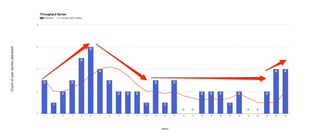
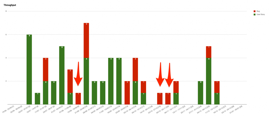
I recommend whenever possible breaking the throughput view by demand type. Thus, it is clear to everyone if the team is able to:
- Balance the number of valuable deliveries (e.g. features) with failure demands (e.g. bugs).
- Deal with urgent demands in a sustainable manner. I often find teams that classify every demand that enters the workflow as urgent and work on them, leaving aside items that will be important to the business in the medium term.
In the example above, the team managed to balance during most weeks user story deliveries with bug fixes. In weeks marked with red arrows, the team had to act and deliver critical issues that were affecting the company’s operation, therefore, it delivered only bug fixes.
Analysis of flow input and output rate
In addition to using the CFD chart (I wrote a full blog post to talk about this view), I would like to present an analysis that I have not seen many agilists do: the relationship between workflow input and output rates. Basically this view compares the amount of items that the team has committed to deliver with the number of items delivered over time.
What insight can be provided by can this type of view? Let’s look at an example.
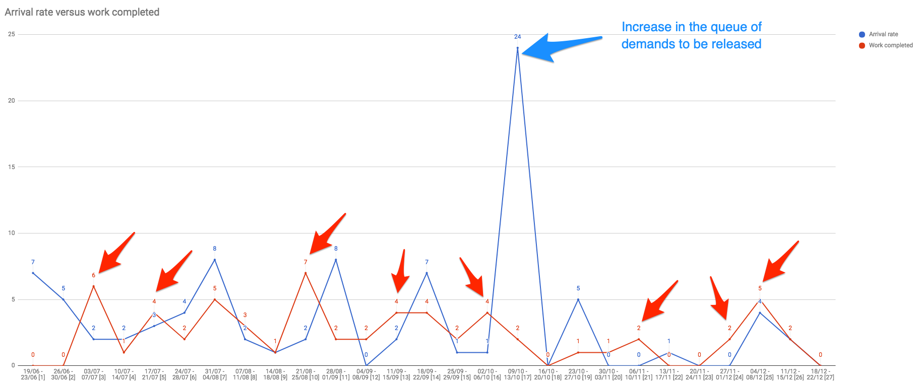
Based on the image above you can make some deductions:
- Of the 27 weeks analyzed, 10 of them had an input rate (items the team committed to delivering) greater than the number of delivered items.
- In week 17 the team had a peak of items committed to being delivered. This happened because the team’s PO was about to go on vacation. Speaking of inventories, I suggest reading Guilherme Fré’s blog post on the subject.
Analyzing the process input and output rate will support the team in understanding whether the delivery pace is tracking the number of committed items. I have seen teams making commitments that are over their actual capacity. This type of behavior leads to lack of trust by stakeholders because the team delivers less than requested, as well as frustration in the team for never being able to deliver “everything”.
In a perfectly stable system, the input and output rate should be the same. If you and your team can develop a process where most weeks these rates are equivalent (e.g., for every 4 weeks, 3 have equal input and output rates), this will demonstrate workflow maturity and represent a highly predictable context.
Conclusion
Incorporating a culture that brings data to your team will enable you to monitor a process that has an essentially complex nature (software) providing progress visibility to anyone interested in what is being built or maintained.
Furthermore, proposing data-driven improvements and evolutions is an excellent way for removing subjective and, to some extent, empty analysis. Basically, I hope that this blog post helps you, agilist, on encouraging people to use less feeling and more facts when they are analyzing a team’s workflow behavior.
If you are looking for advanced material on metrics, I recommend the book I have written Agile Metrics – Get better results in your team. Check out the reviews posted by those who have read it 😏
And you? What metrics have you used to track process health? Share your experiences in the comments below!
What challenges do you face to track the health of your process?
Schedule a 30-minute conversation with one of our experts. A consultant will help you map out your biggest challenges in the development process.