
As we discussed previously in the post Learning with Lead time, analyzing the metric distribution regularly could be a useful tool to improve your software development process.
Before continuing this blog post, I would like to suggest you an interesting read about the questions that surround the definition of Lead time.
At Plataformatec, we have been using Lead Time as the number of workdays between the beginning and the end of an issue (e.g., user story). In other words, as the Thomas reference, we use the concept of Production Lead Time (the clock starts when work begins on the request and ends when the item is delivered. In software development this is sometimes called “Engineering Lead Time” and in Manufacturing “Manufacturing Lead Time”).
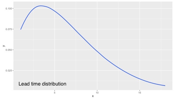
Usually, when you plot out the Lead Time data on a histogram, you would expect to see the preponderance of the frequencies nearby the average value, with about half of the distribution above the average, and half below, as you can see in the images.
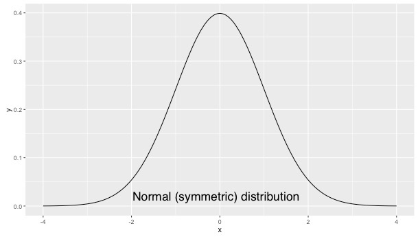
This scenario is common when you are dealing with a normal or symmetric distribution. However, you will observe a slightly different pattern when you study the Lead Time distribution of an agile team.
As we know, a software development process has different characteristics if compared to the standard manufacturing process (e.g., work items follow one of many possible sequential processes; the effort for each process step is different for each work item; work has a natural uncertainty that brings variability for the system).
Studying a little bit more about software development distributions, I found Weibull, a type of distribution that has been used in life data analysis.
According to Alexei Zheglov, Weibull is a family of distributions, parameterized by the shape parameter (β) and the scale parameter (η). It can assume the characteristics of many different types of distributions because changing the β can tweak the shape of the distribution curve.
When β is equal to 1, Weibull is identical to the exponential distribution. In the other case, when β is equal to 2, Weibull is just like Rayleigh distribution, and is possible to interpolate/extrapolate those distributions for other values of the parameter.
To learn more about the impact of the parameters on shapes, I recommend you to read the paper written by Troy Magennis.
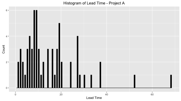
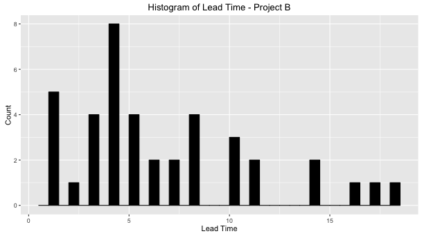
Trying to make the following content easier to understand, I will use in the rest of this blog post a set of data from two Plataformatec projects as examples to explain the concepts. The next table summarizes the project’s context.
Project information
| Project A | Project B | |
|---|---|---|
| Team process | Scrum | Kanban |
| Project type | Greenfield | Greenfield |
| Backlog size (amount of user stories) | 66 | 40 |
Lead Time Histogram
First of all, we need to eliminate the use of average when the team is discussing trends or when they need to estimate a user story deadline.
As I said at another opportunity, using average in a non-Gaussian distribution is not a good practice and for those cases, analyzing the median and percentiles are better approaches to advise the team when they need to estimate the time that will be necessary to create new features in the future.
Let’s see this in more detail, based on the examples.
Average, mode and median
| Project A | Project B | |
|---|---|---|
| Average Lead Time | 14.8 days | 7 days |
| Mode | 8 days | 4 days |
| Median | 10.5 days | 5 days |
| Percentile 68 (Good estimation) | 18 days | 8 days |
| Percentile 80 (Safety estimation) | 20 days | 10 days |
| Percentile 95 (Pessimist estimation) | 36 days | 16.05 days |
In both projects, if the team uses the mode (the value that appears most often in a dataset) to forecast the lead time of new features, they will be estimating a time that is lower than the median (the number that is halfway into the set).
On the other hand, the average will not be a good reference because looking to the distribution it’s clear that the dataset values aren’t nearby it.
At Plataformatec, we are using three ranges of percentiles (a measure used in statistics indicating the value below, as determined by a given percentage of observations in a group of observations) to understand the behavior of the Lead time of our teams.
On the Project A example, the team could provide a good estimation to the Product Owner, when they indicate a range of 18 to 20 days to conclude new user stories, because only 20% of the user stories developed by the team had a Lead Time higher than 20 days.
At this point I guess you are thinking: “Okay, Raphael, now that you proved to me that Lead time distribution is far from being a normal one, how can I get some insights from my distribution?”
To answer this question, we first need to validate if our Lead Time Distribution is a Weibull. The table below shows the project’s parameters and to get that information I used some R code and the spreadsheet developed by Alexei Zheglov.
Weibull parameters
| Project A | Project B | |
|---|---|---|
| Shape | 1.47 | 1.5 |
| Scale | 15.81 | 7.22 |
| R-squared | 0.98 | 0.93 |
In both cases the Weibull distribution fit well for the dataset (If the match is perfect, the r-squared number will be equal to 1). After analyzing an amount of different datasets, Alexei Zheglov observed some characteristics based on the shape parameter.
| Shape | Meaning |
|---|---|
| Less than 1 | The distribution curve is convex over the entire range. This shape parameter range occurs often in IT operations, customer service and other fields with a lot of unplanned work. |
| Between 1 and 2 | The curve is concave on the left side and through the peak and turns convex on the back slope. This shape parameter range occurs in product development environments. |
| Greater than 2 | The curve is convex on the left side, then turns concave as it goes up towards the peak, and turns convex again on the back slope. This distribution shape often occurs in phase-gated processes (waterfall). |
In both cases, the shape was close to 1.5 which means a concentration of lead times on the left side of the curve. The shape parameter defines data distribution, but does not affect its location or scale.
Something interesting to share is that as mentioned at the beginning of the text, both projects were greenfield type, which is consistent with the classification presented above (product development environments).
Based on the shape of the curve (1.47) and the scale (15.81) it is evident that project A worked with long items, which should have generated a great WIP. This type of situation typically occurs when there is a large number of external dependencies and delays over the process.
With these parameters in hand, you as an Agile Coach could identify and help the team to remove impediments and delays, as well as decrease the value of the scale parameter and bring greater predictability to the development process.
In the case of project B, we have an interesting combination of shape (1.5) and scale (7.22) because rarely in a context of a product development, the team could have a different lead time distribution format.
Summary
In this blog post, I tried to bring a new way of analyzing Lead Time.
As software developers, we deal with some uncertainties, questions, and changes that produce high variability in our process.
Learning to understand and interpret the data extracted during development allows us to discuss ways to optimize and continuously improve something that is, in essence, complex (and fun), that is to build solutions.
Understanding how to estimate the correct parameters of the distributions has been significant for the exercises we have done at Plataformatec, creating quantitative models to predict delivery dates.
Good reading recommendations on this subject are:
- Alexei Zheglov and a set of excellent texts of agile metrics, distributions, and probability functions – https://connected-knowledge.com/
- Troy Magennis and his rich material on quantitative methods and software development – http://focusedobjective.com/news/
What about you? Do you think that this subject is relevant to process improvement? Share your thoughts with us in the comments section!
